
By: Nabarun Dasgupta, Colin Miller, Adams Sibley
We were mortified at year's end when politicos did a victory lap over declining overdose deaths. Instead, we are going with Leonard Cohen:
“But listen, love is not some kind of victory march,
no, it’s a cold and it’s a very broken hallelujah.”
What was missing was the love: The failure to acknowledge tens of thousands of you who have served tirelessly for years to care for neighbors and families and patients and communities. This immense national effort. This tireless service borne out of compassion. This service the pediment upon which politicos hoist their triumphal flags.
In November the head of DEA claimed: "We targeted drug cartels to stop fentanyl. Now, overdose deaths are dropping." Seductively simple, bless her heart.
We find that the drop in overdose deaths started in nearly all states in 2022-23. Most states had already reached peak OD well before major cross-national DEA actions (Operation Blue Lotus, Operation Apollo, Operation Plaza Strike, etc.). The declines started before the 2024 arrests of Sinaloa Cartel bigwigs. The "evidence" proffered by DEA for the drop is less fentanyl per pill:
The cartels have reduced the amount of fentanyl they put into pills because of the pressure we are putting on them... For first time since 2021, DEA has seen a decrease in the potency of fentanyl pills. The latest DEA laboratory testing indicates 5 out of 10 pills tested in 2024 contain a potentially deadly dose [2 mg] of fentanyl. This is down from 7 out of ten pills in 2023 and 6 out of ten pills in 2022.
Source: DEA Press Release, November 15, 2024
Fentanyl purity
DEA have yet to release data in support. So we asked the nation's premier private lab, CFSRE to fill the gap. In 2024 they quantified fentanyl, heroin, and para-fluorofentanyl in n=962 samples. Purity ranged from 2.1% to 9.5% by region of the country. Over the course of the year there was no observable trend of decrease nationwide.
Editor's note: We had previously published a graph of fentanyl purity time trends by region in the email newsletter. It was removed at the request of harm reduction programs in New England.
Extrapolating purity by testing a few samples has limitations. It’s Schrödinger's Cat: High potency and low potency versions of the same batch exist simultaneously in the wild until we test them. At that point, we assume the only truth is the one observed in the lab.
Let's make that tangible. When one of us lived in Philly years ago, dealers would give out free higher purity “tester” bags early in the morning to the locals. The strongest bags would benefit those selling; locals would direct monied customers from out-of-town to the corners with the most potent shit. But the con was on. By mid-morning when out-of-towners showed up, the potency per bag would have dropped as the product was diluted to extend profit. The stamped brand on the bag would remain the same. So, which is the true sample of purity, the influencer’s bag or the visitor’s? In complex open air drug markets, social networks and even time of day matter. Local details are always relevant. Sweeping generalizations about purity-up and purity-down are naïve. For both drugs and data, you’ve got to know your source.
Fentanyl prices
In street prices in North Carolina, we observe that 1 gram of fentanyl has gotten cheaper: $100-$140 four or five years ago, to $60-$80 today. Similarly. East Coast prices on pre-packaged bags and bundles (of 10) have also gone down significantly, from $10 bags and $80 bundles, down to $5 bags and $40 bundles.
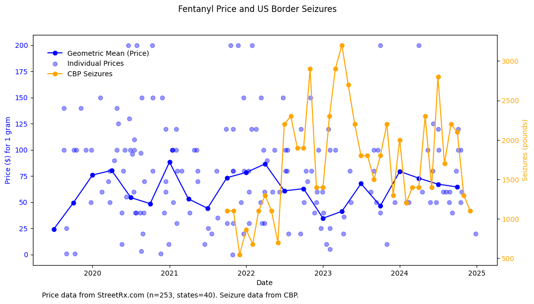
To get broader perspective, we reached out to our friends at LexiGraph who run StreetRx.com. The crowdsourcing website has over 440,000 data points going back to 2010, and is used routinely in street price analysis. We plotted street price for 1 gram of unregulated fentanyl, alongside US Customs and Border Patrol data on the volume of fentanyl border seizures. Looking at n=253 price reports from 40 states through December 2024, the crowdsourced data and what we've seen in NC are consistent. We don't see any meaningful correlation between street price and seizure volume. Do you?
In the absence of government releasing data to back claims, we aren't going to lean too heavily into these analyses because price and purity have a lot of caveats. If you have other sources, we'd love to hear about it in the comments. Onward to things we can observe better.
So what‘s working?
In taking credit for the OD decline, politicos consistently fail to acknowledge the Invisible Work that everyone does, day in day out. It is false pride built on the work of others. Drug users have always kept each other alive, and ignored were the actual people reversing friends' and loved ones' overdoses, distributing supplies to reduce drug harms, or providing effective treatment to those in need.
So that’s where we start. Specifically, Louisiana and St. Louis. Two incredibly hard working teams that changed OD rates locally, and can prove it. In epidemiology there is a nasty practice of dismissing local work as "secular trends," and assuming interventions either had uniform impact everywhere, or zero impact. In an effort to explain the drop in overdose individual local efforts cannot be ignored. Especially when they can be replicated community-by-community nationwide, and when this work has been going on quietly for years.
Louisiana

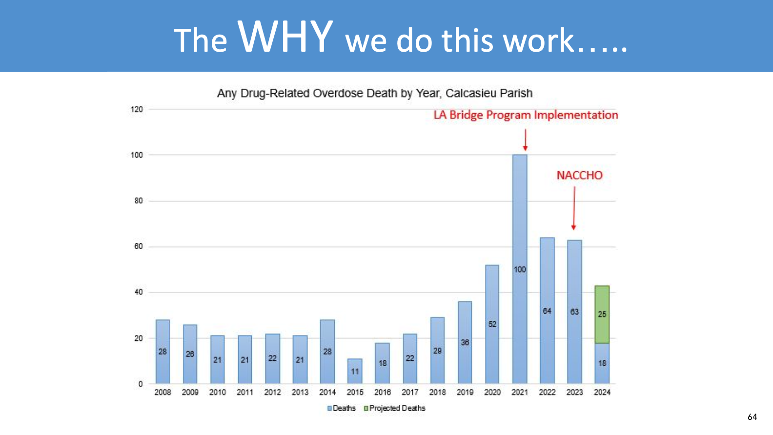
Located in the southwestern heel of Louisiana is Calcasieu Parish. During 2020 and 2021 the volume of fatal overdose cases was doubling, and many people had been seen at the Lake Charles Memorial Hospital emergency department for a non-fatal overdose, prior to a fatal overdose.
In 2021, a team of concerned clinical and public health practitioners reached out to the BRIDGE program in California. Big shout out to Sarah Windels and Arianna Campbell who helped the local hospital establish an instance of their groundbreaking model, providing technical assistance for hospitals to start prescribing buprenorphine in the emergency department. (Reach out to them! They can help.) Other interventions followed, including but not limited to widespread naloxone distribution, both at the hospital and community level with amazing harm reduction partners SWLA Do No Harm. The key thing was that the community was now activated, and they were adapting scientifically proven interventions to local needs.
In a presentation at NACCHO360 in 2024, Traci Hedrick and Melissa Stainback presented this slide (shared here with permission). Overdose deaths went down from 100 in 2021 to around 50 in 2024.
You can see the whole presentation here:
We reached out to Stainback and Dr. Lacey Cavanaugh for an update. Partners at the local Office of Public Health and Imperial Calcasieu Human Service Authority lead Louisiana BRIDGE. They are replicating their early success in other health systems: CHRISTUS Ochsner St. Patrick and Lake Area, West Calcasieu Cameron, and Ochsner American Legion hospitals in Lake Charles, Sulphur, and Jennings. They're working on a formal evaluation, so follow their work.
There is no possible way you can convince us that this effort isn't making a difference. This is not some passive background process; this is a front and center way this community has risen up to the challenge and persevered.

St. Louis
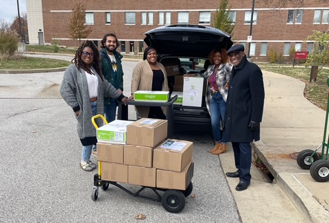
Missouri stands out as having one of the top naloxone distribution systems nationwide. They achieved unprecedented scale and saturation through fiscal responsibility: The state purchased less expensive generic forms of naloxone, and distribution channels heavily prioritized networks of people who use drugs, in order to ensure that the naloxone was actually being used.
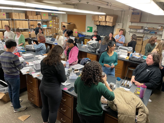
In addition to naloxone, Missouri's Medication First approach to opioid use disorder, expanded telemedicine services, and work with first responders shows a broad community that is engaged and implementing scientifically proven strategies in a way that fits them locally. Sound familiar?
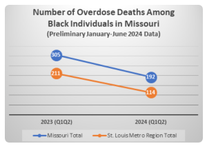
Here's the impact. In 2024, compared to the same months in 2023, overdose deaths in Missouri dropped by 23%. And it wasn't just opioids.
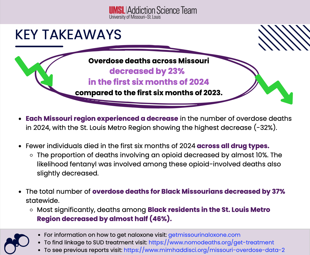
The most significant reductions occurred in the St. Louis region, where overdoses among Black residents dropped by almost 50%. These positive trends are hopefully a testament to targeted investment to serve Black communities with a comprehensive continuum of drug prevention, harm reduction, treatment, and recovery services. (source)
We’ll get to disparities when we go deep on Pennsylvania and Indiana below.
All the Light We Cannot See
We'll miss seeing these stories if we obsess over a single cause for the OD decline. Our minds crave a tidy explanation, but the unstated cost of simplicity is the implication that all these things folks are doing aren't effective.
Psychologists point out that the more distant we perceive the cause of a problem, the less empowered we feel to affect change.
We highlight two key things connecting Calcasieu and St. Louis. First and foremost is community action, as we've seen before. Motivated people with solid local leadership, made real changes. Second, these communities relied on strategies proven to work elsewhere and adapted them locally.
How do they know the results are real? Simple: In small towns and midsized cities you actually know the people you’re helping. Sure, numbers confer legitimacy, but the real metric is fewer holes in the fabric of our communities.
A sudden drop?
Turning back to national numbers, yeah we get it, mortality data have many problems. We don't know when the next update will come, but let's look at the data we have.
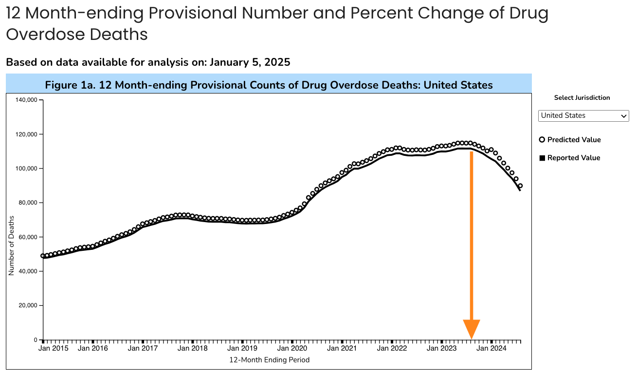
The national overdose death count seems to have peaked in July/August 2023. So it appears as if the reduction in overdoses was sudden. This perceived precipitous fall has been central to hypotheses about a single, national, sudden cause.
Simpson's Paradox, revisited
Now is an excellent time to refresh our earlier warning about Simpson's Paradox. TLDR: In the national aggregate, earlier OD decreases in smaller population states may be masked by simultaneous increases in large population states. Put another way, relying on the national aggregate obscures trends happening locally.

And this is exactly what transpired. Most states hit peak OD and started declining in 2022 and early 2023. Some larger volume states started declining in July/August 2023 (CA and NY) amplified by mid-population states (like NC). Collectively these changes started to visibly bend the curve nationally.
"Bend the curve" is giving us flashbacks, ugh.
What exactly are we counting?
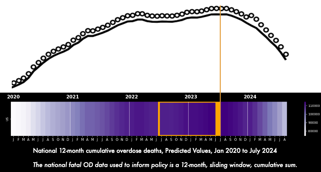
The official overdose graph that drives so much of policy and public discourse is officially titled: "12 Month-ending Provisional Number of Drug Overdose Deaths." It displays "predicted" and "reported" values. Let's unpack:
"predicted" means CDC is running some very reasonable (and disclosed) math to fill in known reporting lags–specific to overdose deaths. The "provisional" part is related, and a designation before states finalize autopsy results.
"reported" means the final official data coming from the states directly, for all deaths.
"12 Month-ending" means that the number on the vertical axis is the cumulative sum of deaths that happened during the preceding 12 months. But, usually when we see monthly time graphs we expect each data point to be the count for that month. The official graph uses a convention that is atypical:
Horizontal axis = calendar month
Vertical axis = yearly count
This matters!! A lot. Understanding this is key to the timing (and hence possible causes) of overdose decline.
🛼 Smoothing inertia
Under the hood, the national OD number is actually "smoothed." In epidemiology we could call it a cumulative sum of 12-month rolling windows. It sounds awkward because it is! It's the total number of people who died of overdose in the previous 12 months. So June and May share 11 months of identical data, with one new month added, and the oldest month lopped off.
Smoothed metrics are, by design, intended to reduce noise by leveling out peaks and valleys to reveal patterns. It prevents panic from small ups and euphoria from small downs. But, smoothing also generates inertia: It delays when we observe the start of a downward trend. This matters because if OD declines started before August 2023, then our universe of possible causes will expand.
Smoothing inertia also hides sudden upticks. One reason why we are going into detail here is for the future: The same smoothing process could also obscure or delay when we observe potential increases in OD fatality, say from nitazenes or carfentanil.
Look, it’s just math. And nothing more complicated than addition. This isn’t an evil algorithm. It’s not a conspiracy. All the data and methods are public. Smoothing is commonly done in other domains and reasonable. So before we can identify "peak OD" or when overdoses started to decline in each state, we have to understand the effect of smoothing.
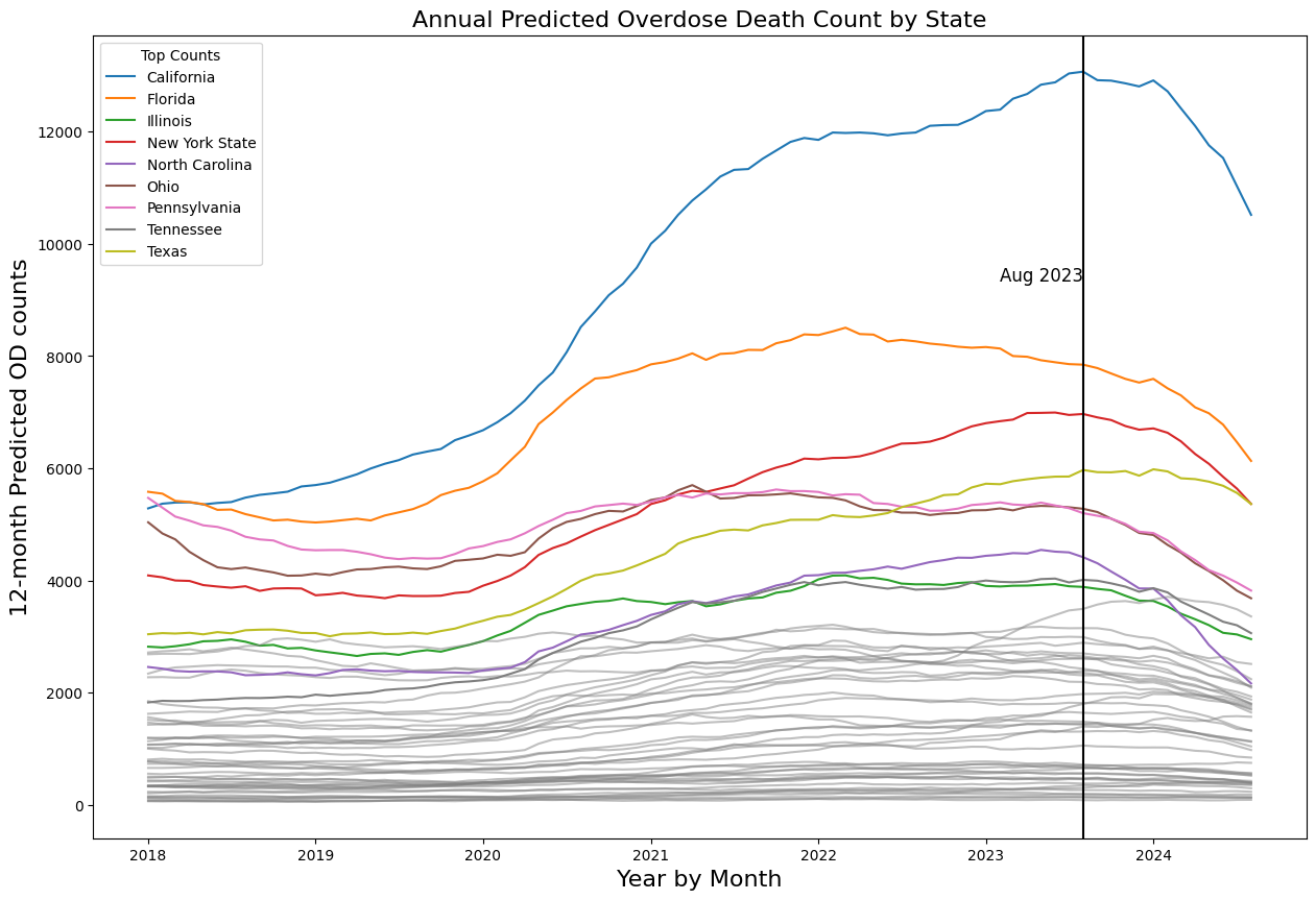
4 States in Focus
Arizona, Pennsylvania, Nevada, Indiana
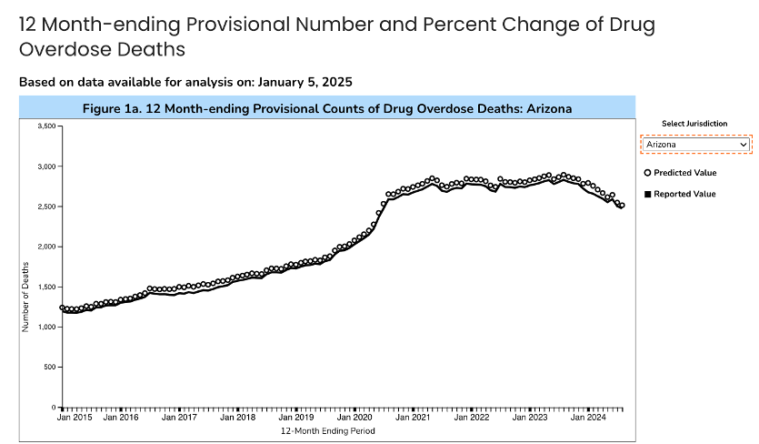
Arizona
Let's look at Arizona to see smoothing in action. The official graph looks like an increase coincident with COVID restrictions, a plateau, and decline starting in late 2023. As you can guess, this isn't quite right.
We remade the dashboard and added overdose fatality data by month. (Thanks to Svetla Slavova at University of Kentucky for the idea!) Below, the violet 💜 line is official data from the CDC overdose dashboard, the same exact data as the graph above. Below, the orange 🍊 line is the monthly count of final certified overdose deaths, aka the messy "truth." But it takes years for those data to post. We downloaded them from WONDER, where they go through 2023. The Carolina blue-ish 🩵 is a yearly line we calculated ourselves by summing the monthly 🍊 "truth" data, a recreation of the yearly violet 💜 prediction.
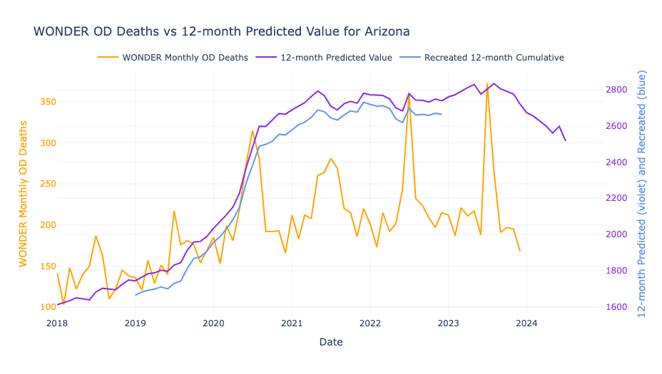
Follow the 🍊 line by month. In Arizona overdoses consistently spike in July. Every year, summer months see an 150 extra deaths... from Sonoran Desert heat? But the 12-month cumulative annual lines 🩵💜 make the peaks disappear. It also artificially elevates the monthly OD rate, a phenomenon called seasonality.
Behold, smoothing.
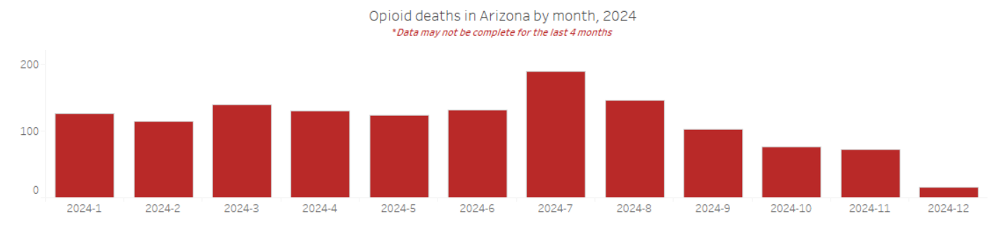
If you’re providing direct service, which line, orange 🍊 or violet 💜, more accurately represents your experience? You're probably hustling to deal with a serious spike in overdoses in ~July each year. The rest of the year, Arizona has fewer ODs than other states (thanks in good part to an effective naloxone distribution network). A smart policy response would be to surge efforts in the hot summer months, as well as understanding the nexus of heat and dehydration and housing and overdose. Here's more up-to-date data from the Arizona state health department. In 2024 they saw the usual monthly spike in opioid overdose deaths in July, with the last 4 months of data incomplete. (Note: this is only opioid ODs, whereas our app is all drug ODs.)
What could account for the decline?
Starting in October 2024, there was a huge increase in the number of reported administrations of naloxone:
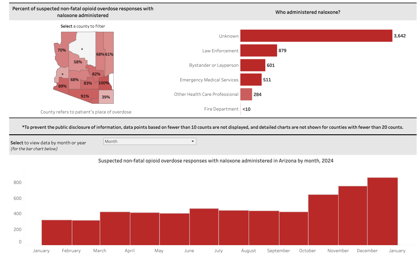
Once the CDC WONDER data for 2024 are released, we'll be able to see if the predicted decline in violet 💜 is even more precipitous during the period of high naloxone reversals. On the other hand, summer 2024 was hotter than usual, so any hypothesis needs to account for seasonality.
To figure out what's causing the decline in overdose, the smoothed 12-month data are simply inadequate. The monthly WONDER and state data are more scientifically defensible. Both are public CDC datasets. It's up to us to choose the right one in making assertions.
Our takeaway: We have to look at raw local data, and measure alternative hypotheses, and must analyze things with granular time periods. Ascribing a single national explanation for the drop in overdoses is not grounded in data.
Pennsylvania
We'll use the Keystone State to make two points: 1) additional detail afforded by querying state data in tandem; 2) the impact of metric used to measure peak OD.
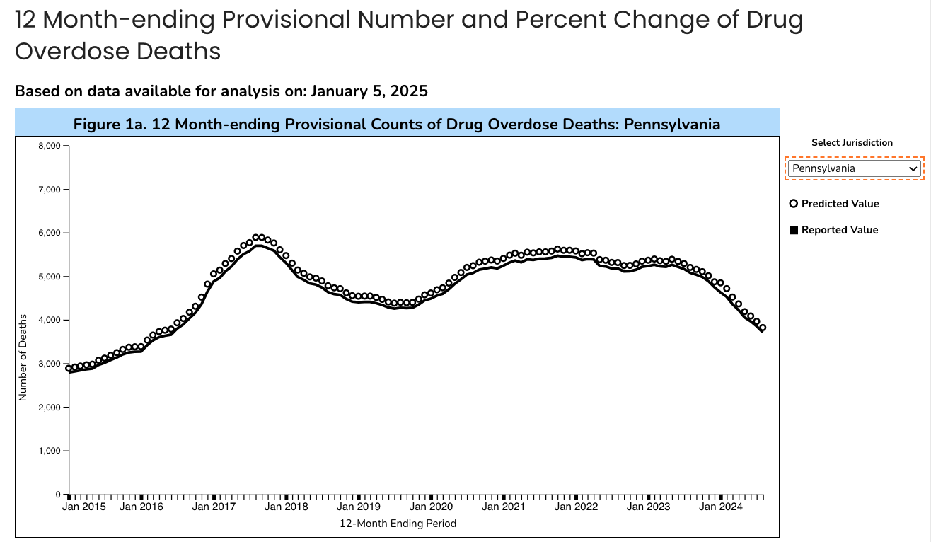
Pennsylvania is an "early peak" state, with a first increase in overdose deaths prior to COVID, and then a later increase during the second year of the pandemic. From a peak in October 2021 with 5,622 annual deaths, by August 2024 the predicted annual count was 3,820, representing a whopping -32.1% decline.
Starting with the official 12-month cumulative graph:
Despite the declines in overdose fentanyl hasn't gone away. The state dashboard shows that 76.7% of overdoses deaths in 2023 involved fentanyl.
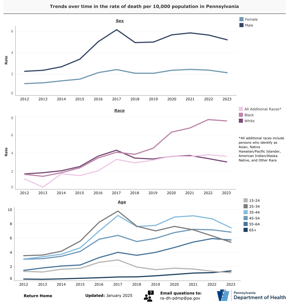
In the "early peak" in 2017, hardest hit were young men, both White and Black races. After that, OD mortality started falling among Whites, but doubled among Blacks during COVID. Rapidly updated state dashboards are critical public health infrastructure, especially to understand what drugs are involved, who’s impacted, and who's left behind.
Back in our app we can see the benefit of plotting the smoothed cumulative CDC data 💜 below because it allows us to see the peak in 2017 compared to our 🩵 recalculated.
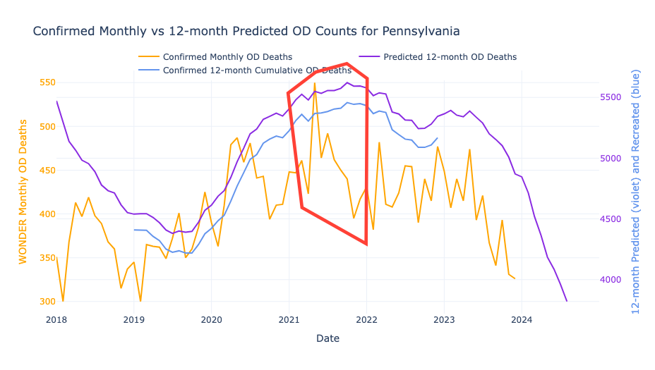
It's clear that the highest single month of confirmed deaths 🍊 was May 2021. However, the smoothed lines 🩵💜 make it seem like ODs peaked in November 2021 instead.
This brings us up a central question:
When do we start the clock for measuring a decline from peak?
Worst-Month-Ever 🍊 is legit, but Worst-Year-Ever 💜 is also valid. In our conversations it seems folks are using 💜 to ascribe causes for the decline. If we go with the latter 💜 then the peak appears to be six months later than the actual 🍊 peak. (We will revisit this 6-month lag later 📌.)
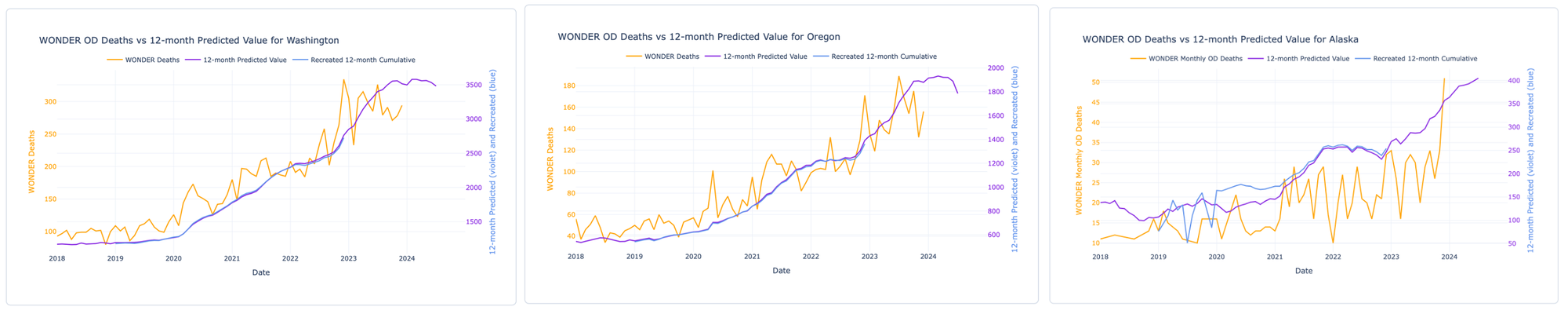
Nevada
Cumulative smoothing also amplifies bad months when they happen in close succession. You know how on the CDC map Nevada looks like a major outlier where ODs are increasing? But actually, the picture in Nevada may not be so bleak.
Follow the orange and purple lines below. Two bad months (March and July 2023), that sucks. 😔 The nature of the smoothing makes it so that when there are a pair of big single-month spikes, the official purple line stays elevated for a year afterwards. Seasonality aside, spikes are very likely to be related to changes in the drug supply. On the other hand, sustained elevated ODs are likely to be fundamental behavioral or social causes. Spikes and smoothed lines can tell us different stories about overdose causes. So, in order to evaluate what is causing the decline, we need to disentangle spikes and sustains.
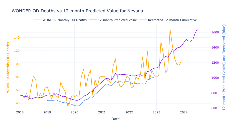
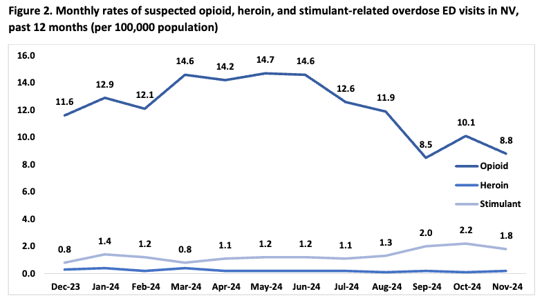
A solution is to go local. Below are Nevada's 2024 hospital ED data for comparison. The state's data (plotted on a proper monthly axis, ha!) show that OD rates have been DECREASING. Assuming mortality is similarly trending, on the CDC website we expect it will take ~6 months from now for the smoothed line to start dropping, and that orange color on the map to cool to blue. But ODs already started declining in June 2024. So for a whole year the smoothing inertia could fuel a misinformed narrative.
So, we built an app for ourselves to look at trends by month. Alaska, Nevada, Washington, Oregon – states that appear to be rising in the smoothed data may already be on the downturn. Link below or go.unc.edu/oddata

Indiana
Last example is a state that peaked early and had a dramatic decline. Seems like something good is happening in the Hoosier State? Comparing the official graph with our app, smoothing erases the early-COVID increase in May-July 2020, making it seem later and shallower than reality. Overdoses peaked in February 2022, with some monthly spikes like in July-August 2023. Are the spikes "just noise" or do they represent fluctuations?
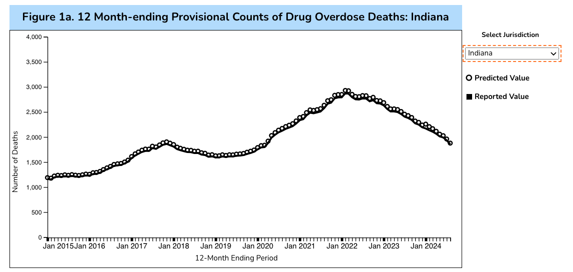
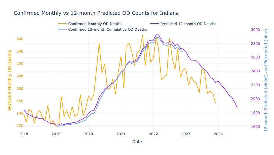
(The near perfect overlap between 🩵 and 💜 indicate this is a high quality and timely data reporting state.)
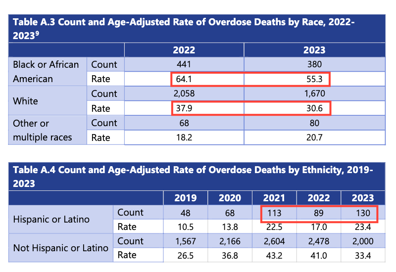
The state dashboard and state report confirm the pattern above, and also provide data by race. Among Whites, the OD rate fell by 19% between 2022 and 2023 to 30.6 per 100,000, bringing it right in line with the national average of 31.3. The good news is that among Blacks the OD rate fell by 14%. But astoundingly, that drop still means that a rate of 55.3 is 77% higher than the national average. The number of Hispanic/Latino OD deaths jumps around wildly. Suicide rates among Whites are much higher than other races. We must pay attention to who is being left behind. And it's not just race x overdose.
The Drug Bust Paradox
Could the Drug Bust Paradox be playing out in Indiana? This causal model created by a former police chief lays out how drug busts can actually increase overdose. Want evidence? This study showed that overdoses increased two-fold in Indianapolis when drugs were seized by law enforcement in 2020 and 2021.
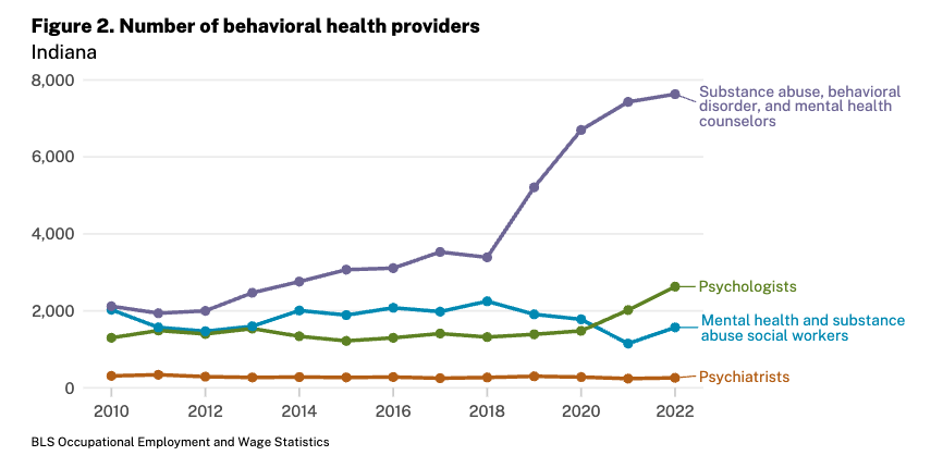
In the other direction, the number of substance abuse counsellors sharply increased in Indiana before the increase in overdose. We wonder about cause and effect. Could increased treatment providers in 2018-20 have a delayed impact driving down overdose rates in 2022-24?
Or what about Indiana having relatively high pharmacy dispensing of naloxone? What about the incredible work of Indiana Recovery Alliance reaching those left out?
Our takeaway is that we cannot simply ignore local impacts; the cumulative effect of interventions cannot possibly be zero. It may be modest, but not zero.
Peak OD
A fresh look at declines by state
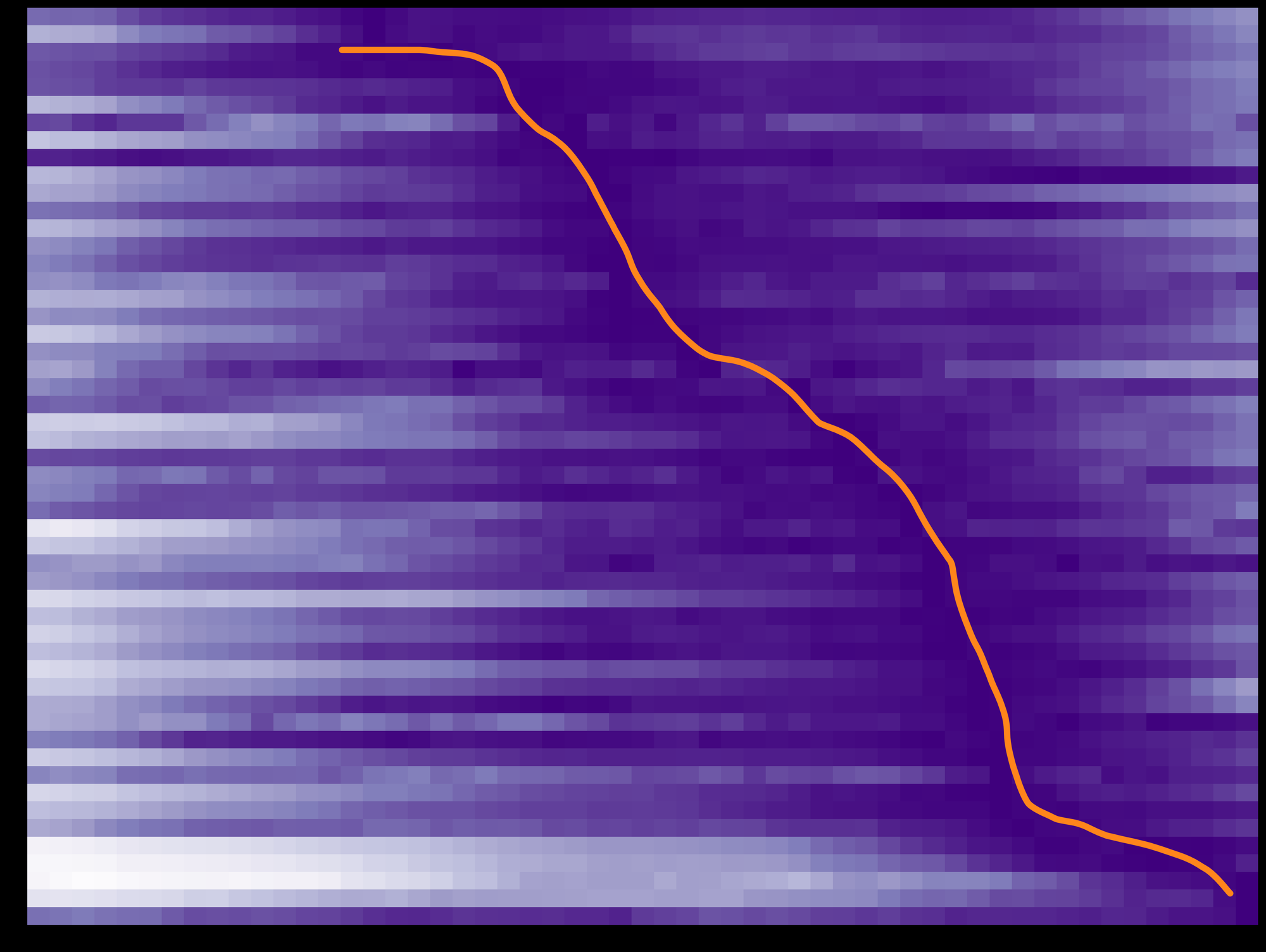
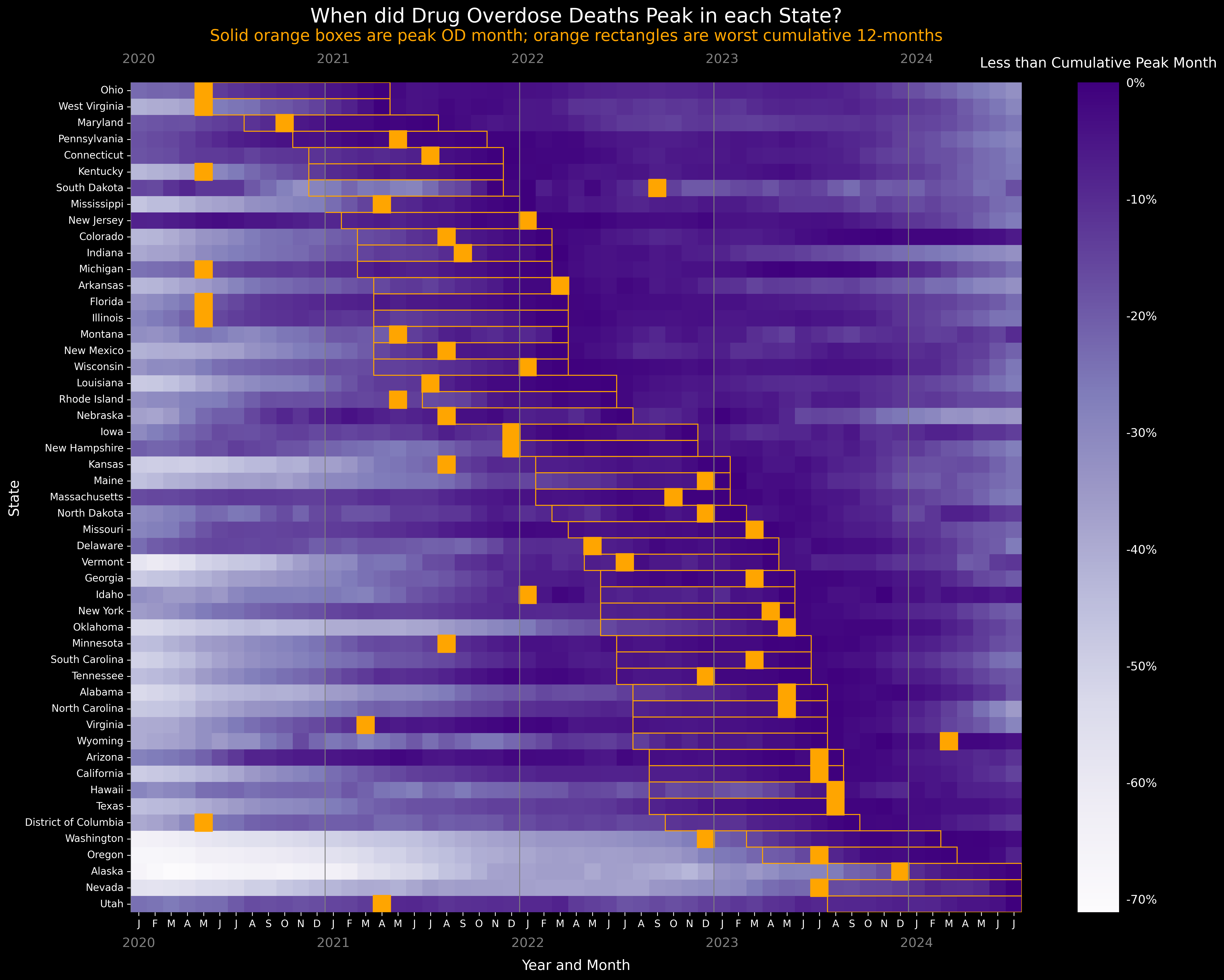
To postulate causes of overdose decline, we first must mark the month when ODs started declining by state. We operationalize this by finding the month with the highest number of drug overdose deaths by state from the smoothed data.
So let's recast the data in the official all-USA line graph as a heatmap. This representation will allow us to quickly compare across states. (Here's the code if you want to Python along at home.)
By longstanding convention, data scientists always plot values at the mid-point of the range. But the official line graph does not. Meaning, the dots on the line could reasonably be shifted six months backwards. Why? Because one dot actually represents an entire 12-month interval. And the midpoint is 6 months prior. Of course, this invalidates some of the point of having speedier provisional data! If monthly predicted counts had also been released this would not be an issue. With the heatmap we can represent this with more fidelity: The orange box is the 12-month smoothed window leading up to the orange line.
In the heatmap below each row is a state. Time (month) is horizontal, from January 2020 to July 2024. Each box in the plot area represents overdoses by state-month. We set the darkest purple to be the highest peak for each state. Purple 💜 = Peak. (Mathematically color intensity purple-to-white represents the percent difference in the absolute smoothed cumulative number of overdoses in a given month, compared to the peak month for that state. We remake the heatmap using a different metric later.)
Rows are ordered vertically from earliest to most recent peak OD month.
Blur your eyes and you can see a dark purple diagonal going from middle-top to bottom-right. That's peak OD month in each state, made more explicit with a hand drawn orange line along this spine of color density.
Imagine what a sudden drop in overdose would look like spread out over states: The orange line would be straight up and down. We could then correlate this date to a national policy change, international action, or sudden drug supply shift. But we see a undulating orange trend line of peak OD month instead. Y'all, the drop was not sudden!
Now we set it all together with orange boxes marking the highest overdose month 🍊 in each state from confirmed data.

Wait wait wait wait wait. Did overdose deaths start peaking in states ~3 years ago, but we are just now only learning about it? 😳
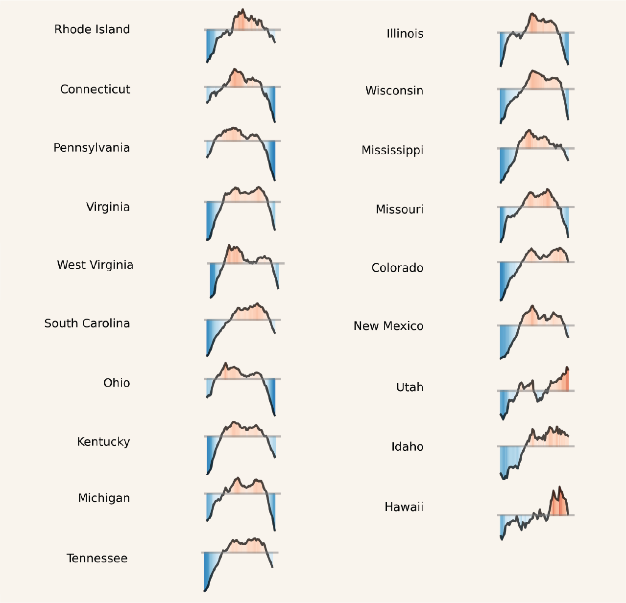
Phenotypes of Decline
Patterns emerge!
We have to ask when, how, and how long about overdose peaks. We can start to see some patterns in how overdose mortality has evolved in the past six years (though we are not conjecturing about the why here).
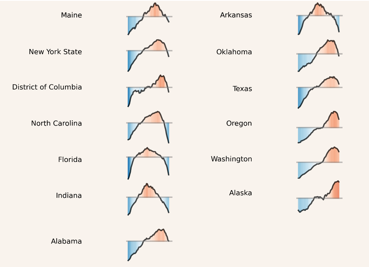
Example one: A linear increase in deaths that's just peaking (or yet to peak). Here's Washington, Oregon, and Alaska:
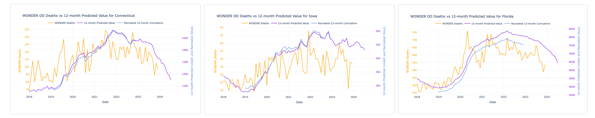
Example two: States where surges preceded and continued through the COVID-19 pandemic, peaked, then dropped: Connecticut, Iowa, and Florida.
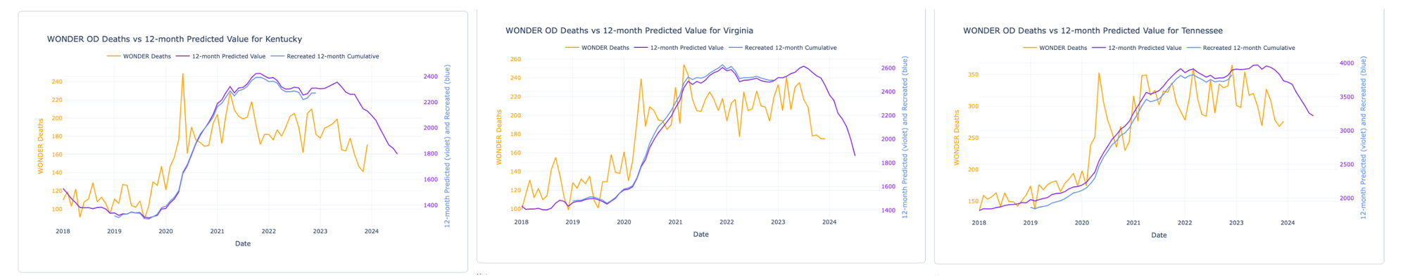
Example three: States where mortality surged suddenly during COVID then flattened into a sustained peak before dropping. Kentucky, Virginia, and Tennessee had precipitous rises during the first year and a half of COVID then had sustained peakedness (platykurtosis for the wonks) for two years before dropping.
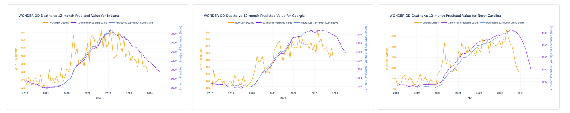
Example four: States where mortality surged sometime during COVID (broadly construed), had a rather quick peak, then declined. Indiana, Georgia, and North Carolina exhibit this pattern (with Indiana peaking earliest of the three).
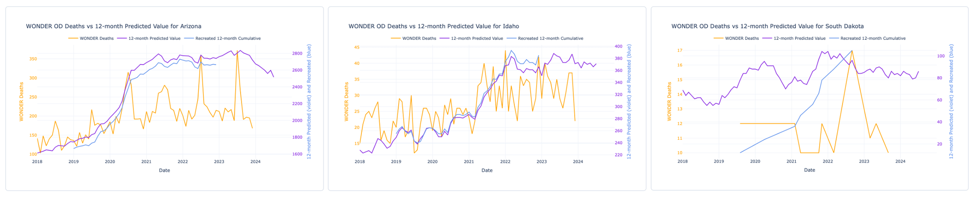
Are these patterns indicative of anything or merely coincidence? After all, some states have unique trend lines – like Arizona (clear seasonal trend), Idaho (ostensibly resistant to the 2020 COVID surge), and South Dakota (too sparse data and noisy to detect a pattern). We're not ready to model these data and offer the reminder that we should be looking to states and communities to guide our answers.
Geographic Patterns
Putting it all together
Drugs don't sweep across the continent like weather fronts.
Instead, it's more like stones skipped across a pond.

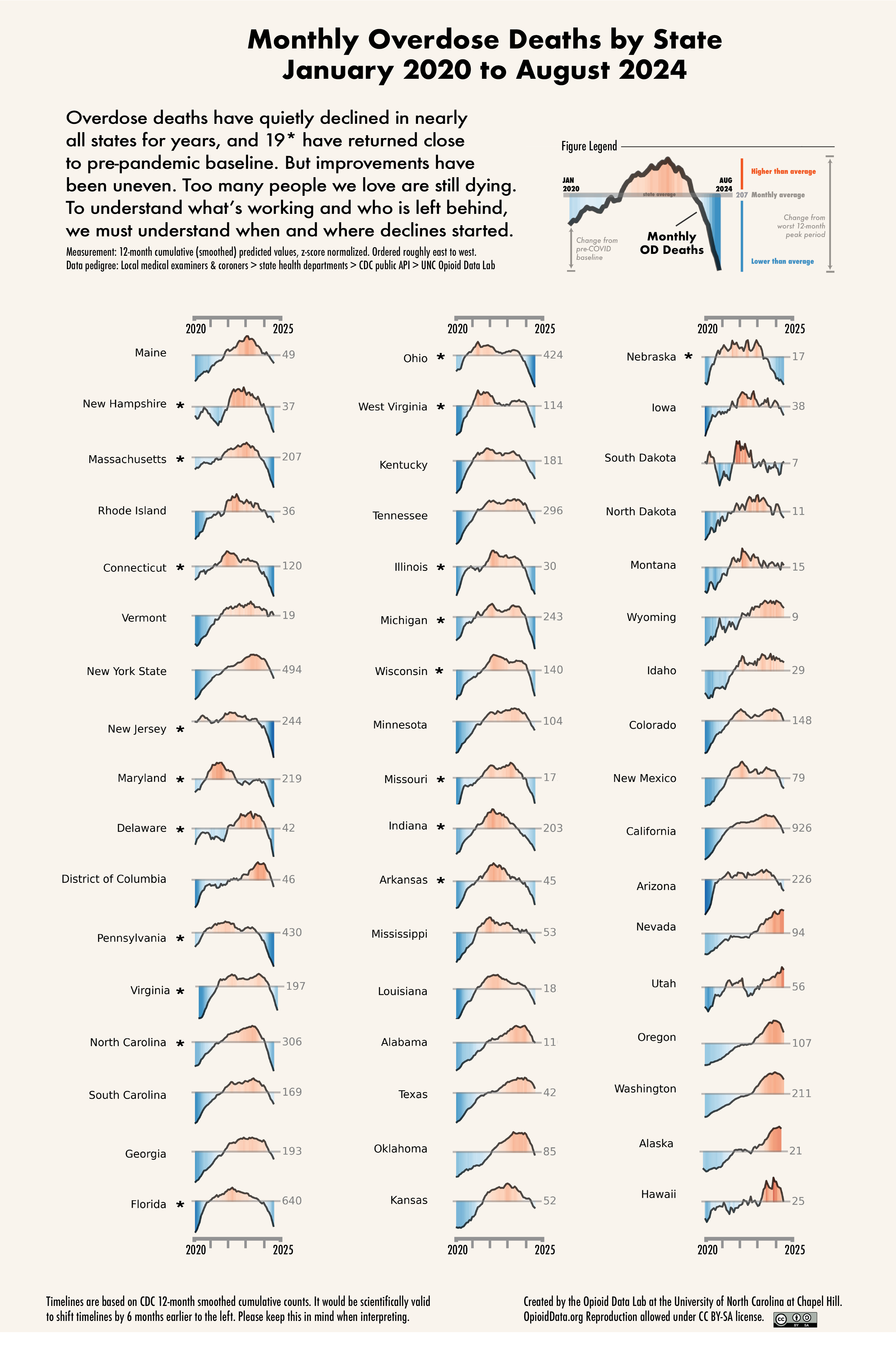
Yes, there was a general east-to-west directionality to the spread of fentanyl, but for most of the country the pattern was more erratic. To visually compare states, we used the 12-month smoothed data to create another visualization. We plotted z-scores of monthly overdose counts from January 2020 to August 2024, by state. (data and code) Z-scores set the state mean overdose count to zero; positive values (red) indicate higher than average, negative values (blue) are lower than average. Each integer represents one standard deviation away from the mean in either direction. (Thanks to Michael Gilbert for feedback on visuals!)
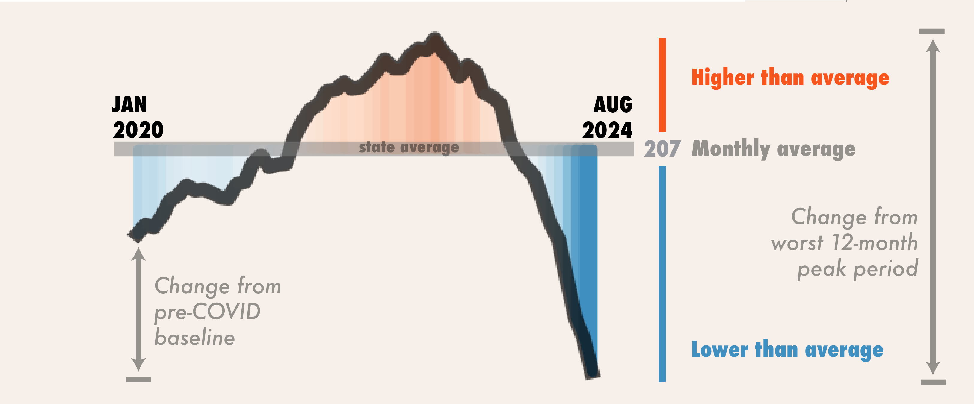
The grey horizon line is that state's average "monthly" overdose count. We can also look at differences in height from pre-COVID baseline compared to August 2024. Similarly we can look at difference from highest peak height to most recent point to get the change from the worst 12-month period. (data & code)
We debated on whether to plot these in time as-specified by CDC, or whether to stagger back 6 months, which would be equally scientifically justified. We chose the former for the sake of transparency, but intentionally focus attention on curve shape.
High resolution version of graphic can be downloaded here:
Return to pre-pandemic baseline
There are 19 states, as of August 2024, that were near or even lower than their January 2020 pre-COVID pandemic baseline. States already lower are: NH, CT, MA, NJ, DE, MD, PA, NC, OH, MI, IL, and NE. States close and trending to pre-pandemic baseline: VA, WV, FL, IN, WI, AR, and MO.
Too many people we love are still dying. A return to a pre-COVID baseline in overdose rates is not a pure victory, because ODs were too damn high before the pandemic. And we strongly caution that sudden changes constricting fentanyl (or xylazine) supply could predictably lead to rapid expansion of more potent opioids and sedatives; we are tracking: nitazenes, carfentanil, bromazolam, and dex(medetomidine).
We caution that we are at a critical time with improvements that are fragile. Abrupt changes in drug policy could perturb the balance and reverse these encouraging gains.
Scientists have pointed out inconsistency in linking the start of COVID to overdose increases. But we lived through that chaos, many of us providing direct services. The graphs above may explain the disconnect. First, overdoses didn't spike everywhere simultaneously in Spring 2020 precisely. In some places (NH, DE) there was a drop. A second wave occurred during 2022 (WI, MI) and another in 2023 (AL, VA). How we define the "COVID period" is subjective: A point in time pursuant to a government declaration? Or, a mini-era of misery. What is factual is that ALL states had increases in overdose deaths after March 2020. Some states had an A-shaped single peak, others had two M-shaped peaks.
A-shapes: Single-peak states
In 15 states we saw what appears to be a single large peak before ODs started to decline: ME, AR, OK, FL. IN are clear. Some of these may be two overlapping peaks close together in time; hard to tell from smoothed data (NC, AL, NY and OK could well be biphasic.)
Still, any explanation of the cause(s) for OD declines has to contend with understanding what was happening on the ground in these places. Spurred by the uptick, could there have been a strong community response and effective interventions that led to the decline? Maybe. We can't discount that possibility. Or was there an abrupt change in the drug supply that led to the increase, and then another change (or reversion) that precipitated the decline? For example, we hear in some places that plant-grown heroin is making a comeback. In others, the downward slope is coincident with the establishment of xylazine. The takeaway: To understand causes of increase or decline, there are other factors that need to be measured independently.
Is state even the right unit of geographic measure? Oklahoma and Texas have similar trajectories, but nearby Arkansas is different. For overdose death counts, much of the volume comes from cities. Ergo, aggregating by state is suspect, albeit convenient. County-level data would be preferable. Alas, county-month data are not easily accessible. The process for getting county-month data from CDC is replete with well-meaning-but-arcane data suppression rules (less than 5 deaths? 🙈 No data!). And you're limited to what you can say publicly because you can't share the data. And the data are delayed by 3 years. And there's a lengthy application process. Bummer, dude. In the national interest, it's time NCHS was unbound from these antiquated rules. (Chris Delcher at the University of Kentucky has a great report on this.)
As an aside, we were struck by the similarity between Washington and Oregon. Those curves are so nearly identical that we looked back to source to make sure things are coded correctly. (They are.) Others have shown, in much more sophisticated analyses, that there's no direct observable impact of M110 in Oregon on overdose deaths once you de-trend for the appearance of fentanyl. The similarity of the curves between WA and OR offer visual support.
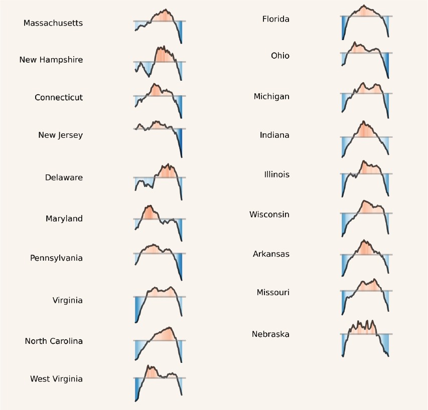
M-shapes: Two peak states
One of the most perplexing facets of explaining the OD decline are that some ~20 states show multiple peaks, separated by months if not years. Utah and West Virginia are perfect examples. When we evaluate causes of "the decline," which decline is it that we are talking about?
That many of these second peaks happened around the same time in early 2023 suggests maybe there is a strong supra-state acting force. Could this be related to changes in drug supply? Pinpointing exactly when the second wave happened gets us back to smoothing. If the second peak shows up in mid-2023 in the smoothed cumulative data, then the real peak probably happened ~6 months earlier. The example above 📌 from Pennsylvania is textbook. That puts us around the 2022-2023 calendar year boundary for the second peak, instead of mid-2023.
East to West
Yes, states with declines are mostly in the east and center of the USA. Yes, some of these are places where unregulated fentanyl had purchase earlier than the West. But declines are inconsistent. Why would states decline even as fentanyl lingers?
Some geographic patterns are puzzling. Even nearby states had OD death peaks separated from each other by years. See Maryland versus DC. We may be seeing the imprint of distinct drug distribution networks, customer preference, and/or impact of local interventions (including interdiction).
But we can't tell from the overdose data when fentanyl started dominating the local drug supply. Luckily Zoorob et al. did that work, encapsulated in the graph below:
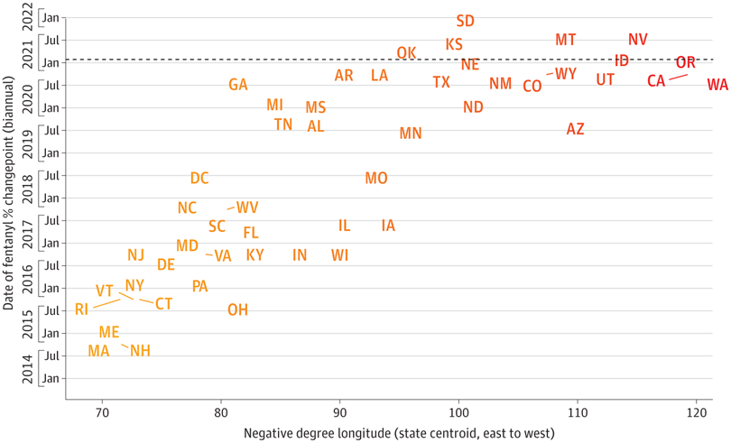
The takeaway is that some (not all) states where fentanyl was established earliest, in New England and the Mid-Atlantic, are also showing the most prominent declines in 2024. But NE, AR, MI, MO don't fit the pattern. And these data do not speak to age, urbanicity, race, or other demographic factors. And some of these are large states where aggregating makes little biological sense (e.g., Pittsburgh vs. Philadelphia) given differences in local drug supply (which we've observed in our drug checking).
Smoothed vs. monthly trends
We can recast the z-scores as heatmaps. On the left is smoothed 💜 and on the right monthly 🍊 confirmed. Vertical ordering is intensity of decline in recent months (negative z-scores).
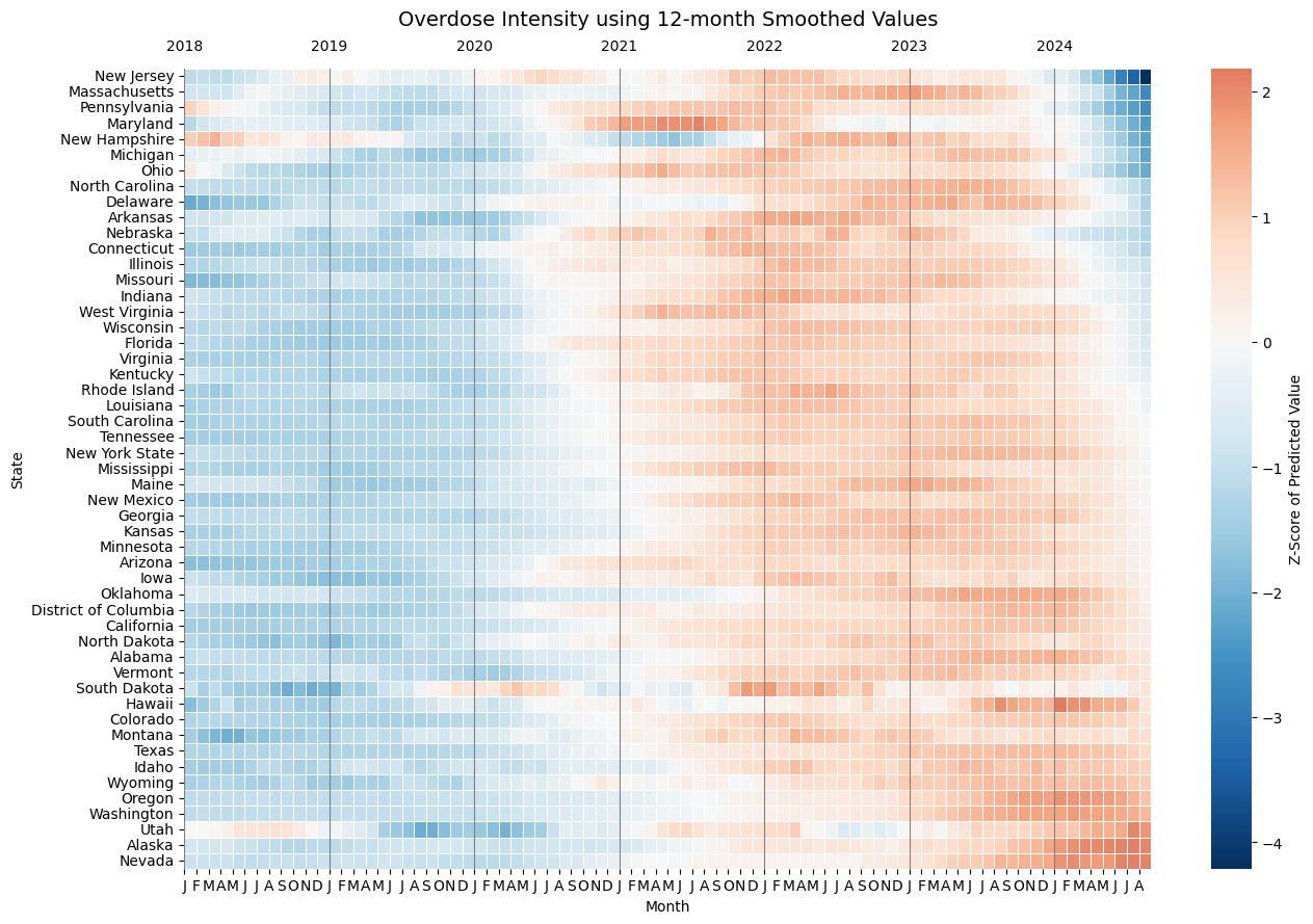
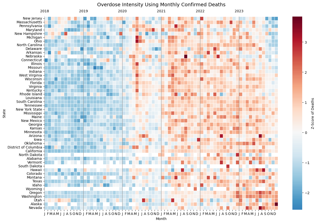
Source (code): UNC Opioid Data Lab using CDC NVSS and WONDER data
In the 🍊 data on the right you can clearly see the run of dark red blocks in half of states representing the instant spike in May 2020 at the onset of COVID. But that spike is erased from the smoothed graph on left.
On the right you can see the effect of CDC data suppression rules (less than 5 deaths that month) that leave white holes in data for NE, ND, SD, WY, MT, HI. There is no chance for deductive disclosure here, and this antiquated rule needs to go.
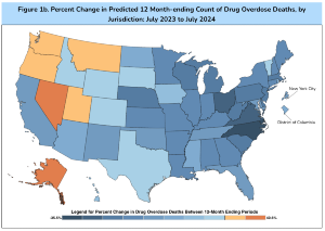
New Jersey, Pennsylvania, Maryland, Ohio, Massachusetts, and New Hampshire stand out as having had the steepest declines in the first half of 2024. While these are places where fentanyl emerged earliest (red on top left of smoothed graph), that emergence happened before 2017 (according to Zoorob et al.), yet the worst period in these states came years later.
On the bottom right of either plot are ~10 states where fentanyl established itself late. In between the top 10 and bottom 10, there are 30 states where the geographic pattern of a east-to-west spread gets thoroughly jumbled. Texas and New York started their declines late, putting a serious damper on a simple east-to-west narrative. While the narrative may hold for parts of New England/Mid-Atlantic and the west coast, for millions of us not living in those regions, the fentanyl sweep explanation doesn't hold. Neither does the idea of attrition (depletion of susceptibles) through death.
Implications for Analysts
Also news organizations
Historically our shorthand for the rise and fall of national drug crises distilled down to dangerously simple explanations, see the "crack babies" fiasco. Years later when data became available, scientists refuted or added color (ha!), revising our collective understanding. Directly impacted people and service providers did not benefit from insights, calling into question the importance of the "research" enterprise. Is the current blowback against academia any surprise?
The slow pace of inference was further removed from the public by being hidden behind paywalls. In the meantime, a dominant public narrative flourished based on anecdotes and reinforced by our mental expectations.
This is the first major drug crisis that has emerged and appears to be peaking🤞🏾in the era of modern empirical data. It’s time we use more advanced methods and publish our results quicker. (We see you instrumental variables, ARIMA, and counterfactual models!) We showed how localized measurement of interventions is doable with secondary data a decade ago, continuing now with CORE NC tracking opioid settlement spending. If public health hadn’t been so fixated on the narrative of inexorable increase (“fentanyl potency explains everything!”), we could be carrying better tools now to assess causes for the downturn. Like hiking poles more useful hiking down the mountain than the climb up, we need different tools to understand inflection points and declines.
A few years ago we participated in a national seasonal influenza forecasting competition. The best models were excellent at predicting upwards and downwards slope trajectories once they had begun. But they all sucked at predicting changes of direction, and failed to pinpoint the week in which flu would peak. The same cognitive and mathematical biases operate with overdose prediction.
Here's our recommendations for analysts:
- Sensitivity analysis required. We urge utmost caution using pre-smoothed 12-month cumulative provisional data in time series analysis. At a minimum, sensitivity analyses should adjust back the date to the midpoint of the range, shifting 12-month smoothed values back in time by 6 months. Whenever possible, use confirmed data by month.
- Cross-check national trends using state dashboards. Here's a list. Encourage your state Tableau heroes to update dashboards quickly and make the data downloadable.
- Test assumptions. When doing interrupted time series or changepoint (segmented) regression, be sure to test assumptions of linearity. Two-peak states may require modeling techniques like splines.
- Pay attention to outliers. There are many states that don't follow expected east-to-west or fentanyl emergence patterns. We aren't just flyover states.
- Embrace modern modeling. Go beyond the flawed comfort zone of logistic regression, and simplistic pre-/post- frameworks. Testing single-cause hypotheses without multivariable adjustment for competing causes is unlikely to be scientifically valid. (We're also talking to you, Journal Editors.)
- Allow for changes in direction in predictive models. Using historical data around the time of peak ascent and descent will be challenging.
- Gather data on interventions. Look around for secondary sources. Don't burden community programs with onerous data collection, and they deserve to be compensated for their data.
- Make your work accessible now. Publish open access with plain language and graphical summaries. Short videos?
What do we do now?
For policymakers and direct service providers
In closing, here are the main actions:
- Don't let up. Tens of thousands of people keep dying. Keep going with the interventions that are based in scientific evidence.
- Be critical - not all interventions are created equal. Use opioid settlement funds wisely. A must-read study reveals that continuing to use drugs is less risky than forced abstinence "treatment." 🤯
- Ask who is being left behind. Gains in reducing overdose are not experienced uniformly. Some community efforts are addressing this directly. But we should constantly be making sure nobody gets left behind.
- Address other drug-related harms. Skin wounds, hepatitis, endocarditis, etc. all stem from an unregulated drug supply. Stimulants and sedatives are also in the mix. A solitary focus on overdose prevention or OUD or fentanyl is shortsighted.
- Properly resource medical examiners. Whether redirecting opioid settlement funds or setting new state allocations, medical examiners need more support to address the caseload for autopsies.
Your Turn
In our next post we hope to delve into theories why ODs are declining, with data. Leave us comments below on what you think is behind the improvements. Thanks for reading!
Even a single death means something. To those who care, and even to those who don’t. Even a single death makes a demand on us all.
-Vaseem Khan
Suggested Citation & Code
This post, code, data, and infographic files have been stored on Carolina Digital Repository. This work can be cited using DOI 10.17615/fr0z-be38. See accompanying GitHub repository for data, code, and files.
Thanks to Paula Gildner for proofreading!