In the aftermath of a presidential election, there is a lot of navel gazing about the reliability of prediction models. The lesson is clear: It takes immense skill (and a touch of good fortune) to model complex human and social phenomena with mathematics.
And so, predicting big trends in overdose takes some panache. Cynically, the scientific literature is replete with mediocre predictive models who's big conclusion is shockingly that previous history of overdose is predictive of future overdose. Meh.
But there is just one model that I've come to trust, after watching Mo Jalali of Harvard Medical School present at the RADARS Annual Meeting in May 2023. His presentation is based on this paper (and supporting information) published in PNAS, with Tse Yang Lim as first author. (The research was funded by the US Food and Drug Administration, which also funds science at the Opioid Data Lab.) It's a dream team of modelers in this space; Stringfellow and especially Wakeland have been doing opioid systems modeling for a very long time. These authors are solidly credentialed.

Read on for our take on the model and what they got right, and what didn't pan out. We promise we won't get into the Greek-letter equations 😉 but the lengthy supporting information is worth a closer look. 🤓 Read on below the break.
Timeline
First, let's get the timeline right. They submitted the paper in August 2021, and used data through 2020. They predicted the trajectory of the overdose epidemic going forward to 2033. Think back. This is before COVID vaccines, and we were still isolated. Overdoses were skyrocketing. This was a moment of grave public pessimism. Into that breach, Lim et al. stepped forward with predictive modeling suggesting that overdose deaths would start to decrease nationally in 2023.

But they were right!
The current decline in overdoses arrived when it was predicted. And moreover, the rate of decline (slope or downward trajectory) aligns remarkably well with what is happening today. I've used a modified and simplified version of their predictive model output in my slides for the last year. In those talks, my rhetorical point has been that we have a full decade ahead of us where there are more than 50,000 overdose deaths per year, even if we do everything right. (By comparison, all of Scotland, England and Wales has 5,000 OD deaths per year. Regardless of population denominators, the sheer public health magnitude of what we face in the US is staggering.) In my talks I exhort us to take better care of the people providing front line services, because the accumulating grief is a tangible threat to public health capacity. And it's gonna be around a long time.
Putting aside immense societal grief for a moment, let's look at what Lim et al. predicted:
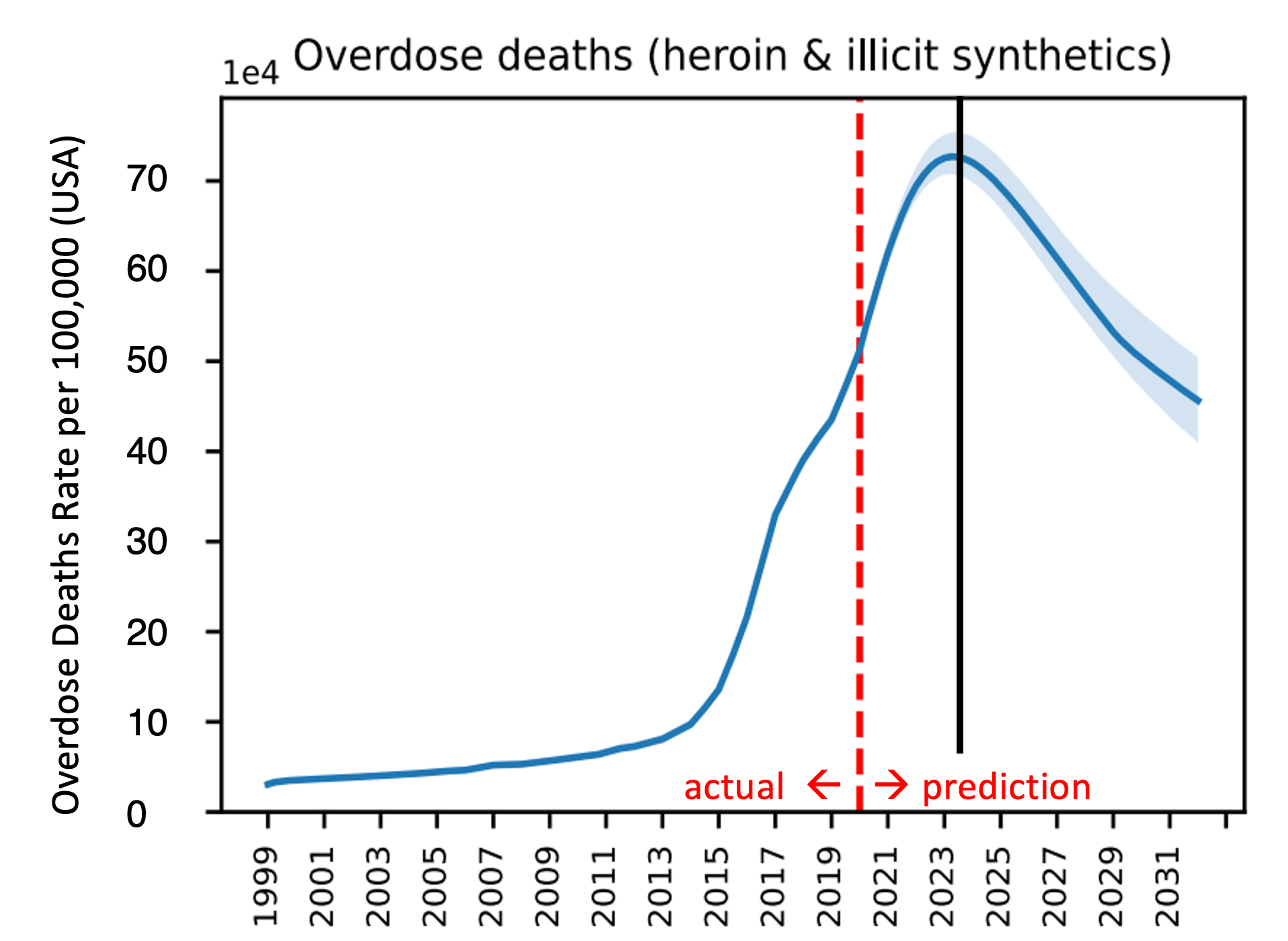

Okay okay, I get it. Academic exuberance when there are so many people dying is unseemly. Those are my friends lives that accreted into that blue line. Here's one of them, Tony Givens, who passed in 2004. Miss you, brother.

But let's see what worked so we can get a sense of how to get these stubborn numbers to stay down.
(The last person to say "bend the curve" buys the next round of drinks. For Tony that would have been a Rusty Nail, eww gross.)
What's under the hood
We can think of the model in 3 parts:
Historical information
The historical information they used is store in something they call SOURCE for "Simulation of Opioid Use, Response, Consequences, and Effects." (Strong acronym work there.) They used ~15 different national datasets measuring different aspects of opioid use/problems to replicate (blue line) what really happened (grey dots) from 1999 to 2020.
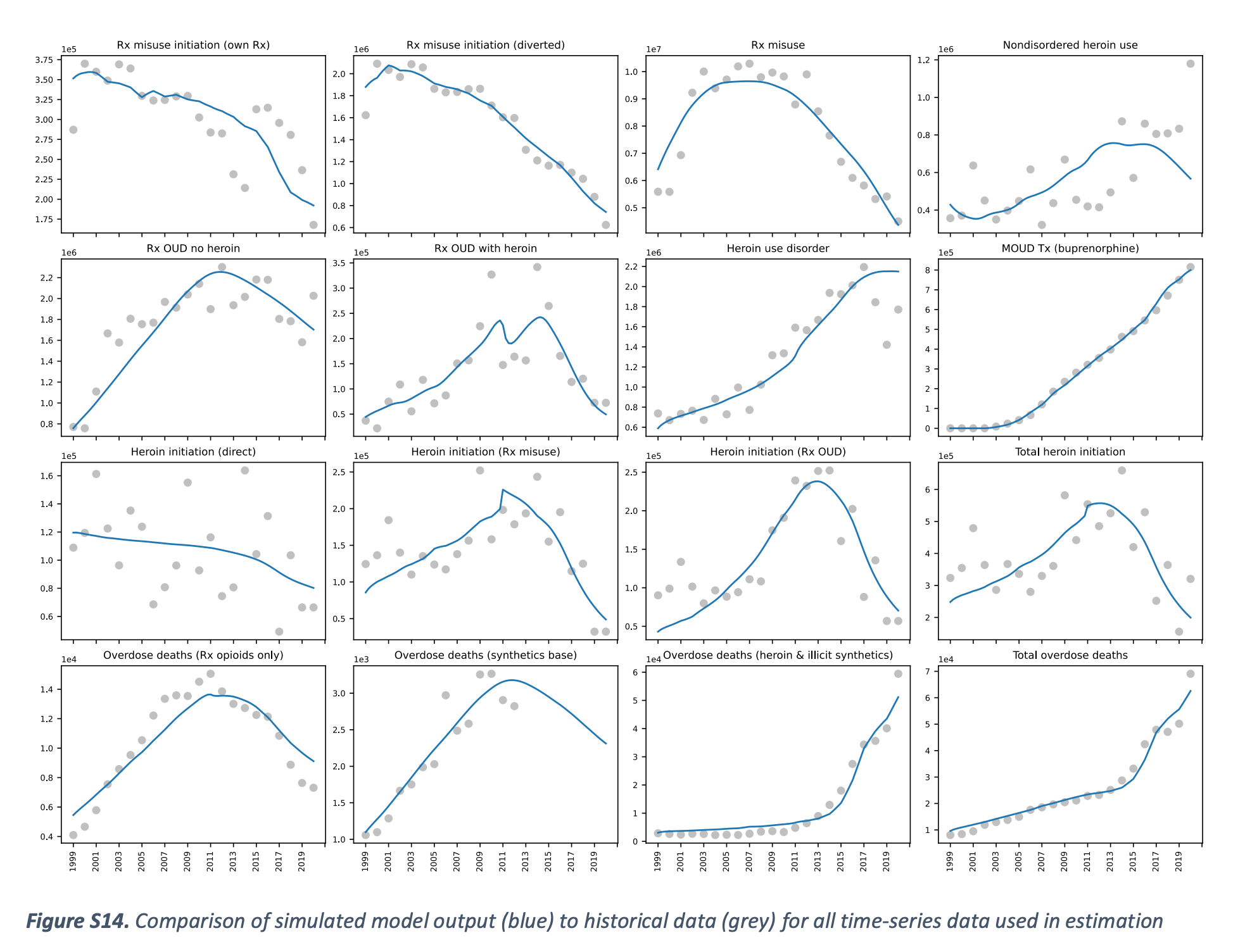
Pause here, youngins. Starting around 2012, we shifted from Rx opioid overdoses to heroin, and back when the model was being conceptualized (like 2019 or so), heroin was more common than fentanyl.
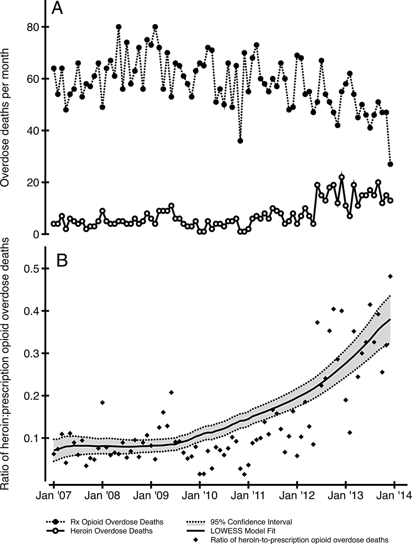
The transition to heroin was well under way by 2019, so reading this model in almost-2025, it feels anachronistic to have such an emphasis on the transitions from Rx opioids analgesics. And I will point out to my beloved community of folks living with chronic pain: This model largely ignores your plight. And yet it still accurately predicts the decline in overdose today. Why? Because by the middle of the first decade of the 2000s, it was not patients in chronic pain who were dying from overdoses on their prescriptions, that rate was 0.022% as we've shown. (Sadly in recent years, suicide among long-term opioid patients who were abruptly discontinued is horrific.)
Rather, the Lim et al. model is looking at people who who were using both heroin and Rx opioids. What is important though is the concept of new initiates. Which brings us to transitions and flows at the individual level...
Mathematical functions
The simplified take of the complex math is that 1) individuals can change, and 2) external factors have impacts.
Individual flows
The basic concept here is that individuals who are using drugs, as well as service providers will change "states" over time. In the graphic below, the top half are people with OUD, and the bottom half are clinicians prescribing buprenorphine. So the modeling process really got into the weeds.
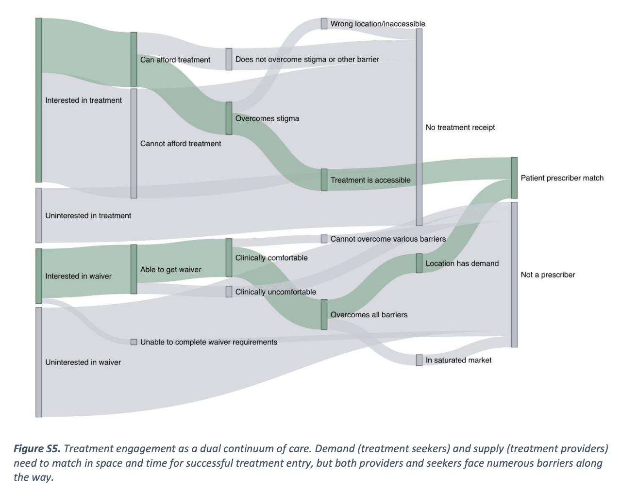
Here are patient level flows in more detail. Even though the thickness of the arrows is the same in the figure, each arrow is specified independently and can be set to have different effect sizes.
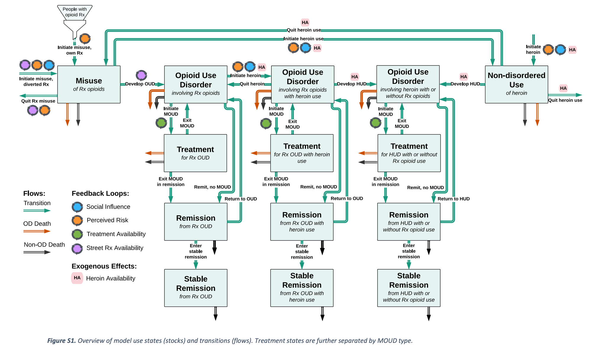
Again, starting with Rx opioids as the incoming funnel will be uncomfortable, as if the whole problem is being blamed, yet again, on pain patients. Optics of the graphic aside, let's look at the actual numbers used. They used the IQVIA (neé IMS) outpatient pharmacy dispensing number for all opioid analgesics, from 1999-2020. So, if you got a Rx for wisdom teeth extraction, you're represented in here. Effectively, this is like 20% of the entire population. The starting point is important, but it's also so big that "People with Rx opioid" should not be construed to mean chronic pain patients. Capiche?
I speculate there is also some bureaucracy that influenced the model. The emphasis on prescribing is likely an artifact of FDA's funding and involvement in the study, because the Feds in the early 2020s had an uneasy entente: Division of responsibility was split between FDA (Rx opioids), DEA (street drugs), SAMHSA (treatment), and CDC (overdose). A lot of these boundaries have eased now, but I can see the imprint of the bureaucracy on the science.
External factors
These are the factors they looked at:
- Barriers to treatment, including transportation
- Treatment capacity (including bup, methadone, and Vivitrol)
- Treatment duration
- Rate of remission from OUD
- Abuse-deterrent formulations
- Street prices (from StreetRx.com)
- Heroin prices
- Fentanyl market penetration
- Naloxone kit distribution (including OSNN Buyers Club)
- Probability of witnessing an OD
- COVID
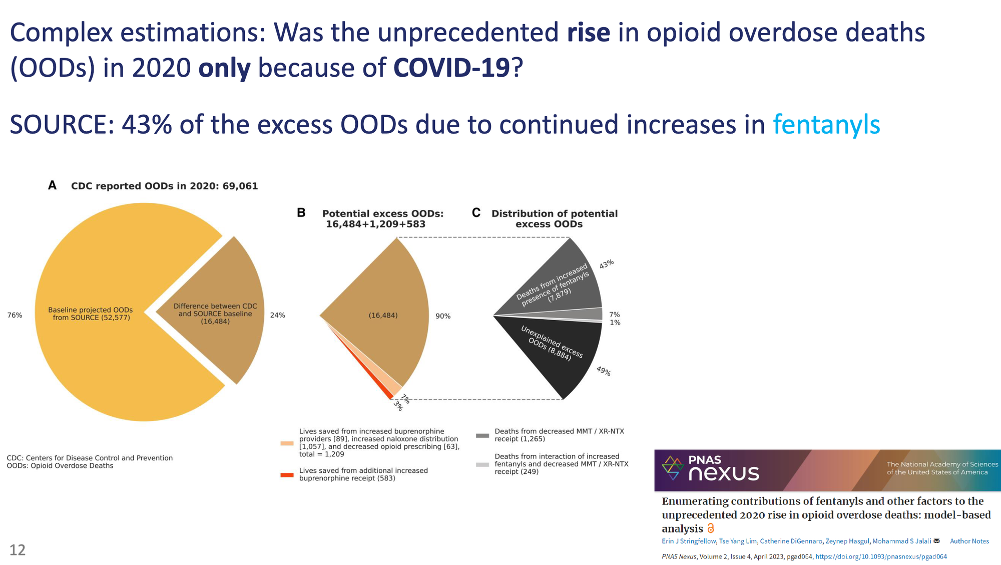
As an example, here's their thinking on how they disentangled COVID effects.
They also model things dynamically based on changes in public perception of risks of drug use.
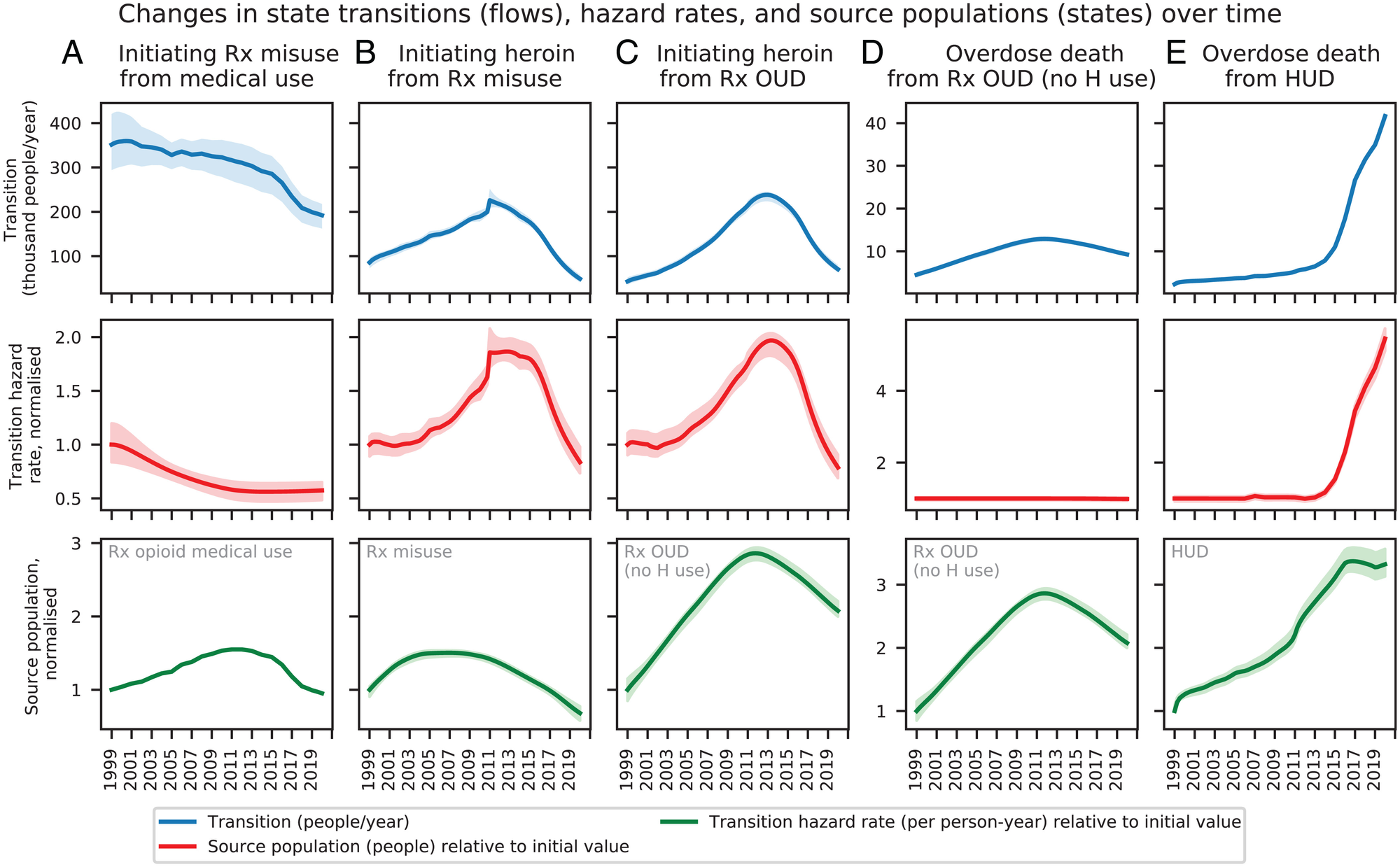
Two key endogenous processes in the model are social influence, whereby existing users of a substance can increase initiation rates or accelerate use disorder development, and risk perception, whereby overdoses, especially overdose deaths, increase the perceived risk associated with prescription opioid or heroin use and discourage initiation. The model also endogenously represents the dynamics of demand for and availability of prescription opioids for misuse, which influence initiation and use disorder development.
Combined together, these "states" end up looking like this:
Predictions based on scenarios
The last component of the model are hypothetical scenarios. These are intended to convey a range of possibilities of interventions and changes in street supply. For example, they show what ODs would look like if fentanyl hadn't replaced heroin (red lines below), or without naloxone distribution (green).
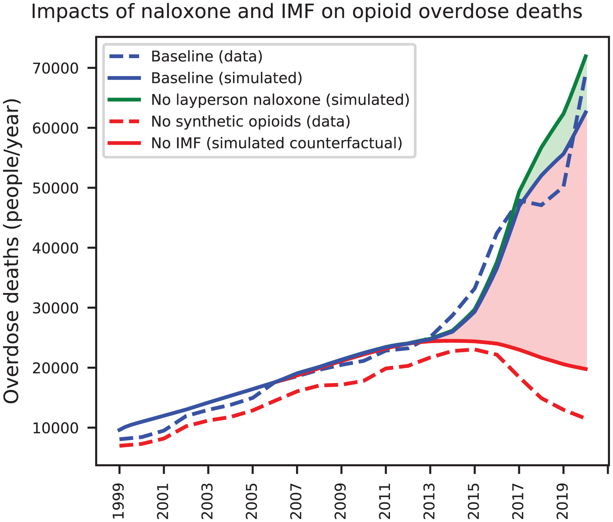
The naloxone distribution is interesting. They show a modest effect, which is fair for the time at which the model was made. And they are mostly looking at pharmacy dispensed naloxone. Actual community-based naloxone distribution ramped waaaaaaaaaay up in 2021, so the actual impact of naloxone distribution is probably more impactful than the model expects.
Back to the model. They present scenarios. First one is a scenario cleverly called exogenous trends continue (ETC) – meaning things continuing along the trajectory as was known in 2020 before the emergence of illicitly manufactured fentanyl. And there are two other "optimistic" and "pessimistic" scenarios.
here we present three scenarios: an “exogenous trends continue” (ETC) scenario, where SOURCE’s exogenous inputs are assumed to continue their present trends at decelerating rates, stabilizing at plausible levels by 2032, as well as two variants of this scenario with more “optimistic” and “pessimistic” outcomes (Table 1). The optimistic case assumes lower IMF prevalence, higher naloxone and MOUD availability, and greater reductions in opioid prescribing than the ETC case, while the pessimistic case is the reverse. These scenarios should not be considered precise forecasts nor analyses of any particular policy interventions, but instead plausible future trajectories for the evolving crisis.
Putting it all together
So, putting those 3 components together we have 3 sets of graphs. Top is heroin or Rx opioid initiation. Middle is OUD. And bottom is overdose. Left of the red dotted line is actually observed data, and to the right are the model predictions.
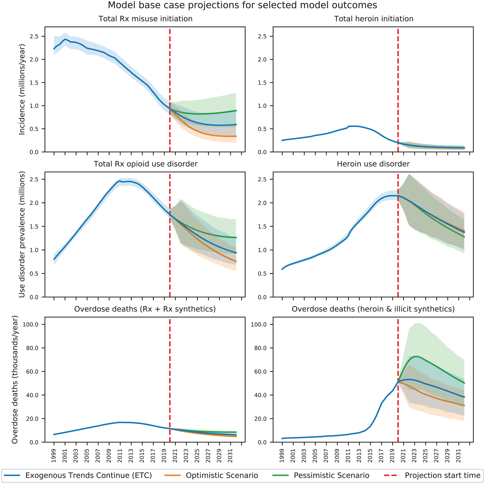
The top panels do give us reason to suspect the "depletion of susceptibles" hypothesis may have some truth. The number of new initiates has been dropping for a decade.
Let's zoom in and focus on the bottom row for overdoses:
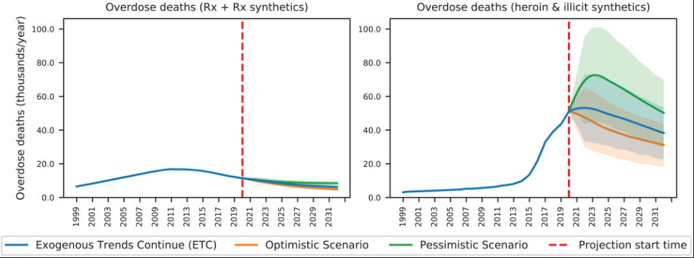
First, note the left panel. Deaths from Rx opioids are MUCH lower than deaths from illicitly manufactured fentanyl (right panel). This jives with what has actually happened.
Worst of the worst
Now, on the right, we see the model predicting that ODs from street fentanyl and heroin. Sorry y'all, the pessimistic scenario is the most accurate one in green. The bold green line is the core model's prediction, and the light green represents different possible ways that dark green could like based on simulations. In other words, the top of the light green region is pretty close to what actually happened. I'll say that again: Our collective in the last few years was the worst case simulation using the most pessimistic model. Yeah, remember what we were saying about grief? It's what we've lived through. The worst of the worst scenario.
Despite that, the model still predicted that ODs were to start dropping in 2023 or 2024. And that's where we are today. Some states started dropping in late 2023, and most states show declines in OD into 2024.
Summary
So in summary, I don't always trust models, but this one I do.
To my knowledge, this was the only group of mathematical modelers who got this right. (Let me know if I'm wrong! opioiddatalab@unc.edu) For many of us, the sudden drop in overdose deaths over the past year has come as a surprise. It's hard to believe it, after all these decades of grief. We are inured to optimism. So, it gives us some hope to know that the most sophisticated prediction of our current state accurately portrays what much of the country has recently experienced.


